

Buying a car is a major decision, and it can be even more overwhelming when you're new to the country. For many Chinese newcomers in Canada, challenges like language barriers, unfamiliar vehicle specs, and a lack of trusted resources often make the process more difficult than it needs to be.
Righto App set out to make car ownership in Canada easier for Chinese-speaking consumers by creating a platform to help research, build community and provide ratings for vehicle-related services.
As one of two designers, I co-led the design effort from the ground up. With limited resources, I focused on research-backed decisions and user-centric thinking to shape the user experience and help bring the product from 0 to 1.
Users became part of our community
Local businesses brought onboard as service partners
To better understand our users, we began by interviewing a small group of Chinese-speaking individuals in Canada who had either purchased a car or were actively looking to buy one. Our goal was to gain more insights into their car-buying habits and pain points.
Participants preferred to go with shops or sellers that someone they knew had already tried, whether it was a close friend or a coworker. Getting a referral gave them reassurance that it was a safe choice. As one participant shared, “Having someone to guide me made a big difference.”
Participants naturally turned to WeChat groups and Chinese platforms to ask questions that don’t usually come up in reviews or mainstream sources. Beyond language, WeChat is already part of their everyday life, so it made sense to go there for advice too.
Participants often felt that general information wasn’t enough, so they turned to platforms like WeChat to ask questions that aligned more closely with their background, life stage, or personal needs. As one shared, “I just wanted something more specific to my situation.”
Participants expressed concerns about being overcharged, especially during repairs or when buying a used car. Many also felt confused by the process itself. For instance, not knowing that insurance had to be arranged before picking up a vehicle.
In addition to the interviews, I also took the initiative to research and analyze datasets relevant to our product, such as car ownership rates by age group in Canada, the ratio of Chinese newcomers in Ontario, and user demographics on Chinese social platforms. Below are the patterns I identified from that research.
Although car ownership is lowest among 18–34-year-olds, this is expected to shift as they grow older. With ownership rates increasing by 20% after age 35, this young and digitally native age group represents a high growth market.
Around 200,000 Ontario residents are recent Chinese newcomers. Many arrive through economic immigration programs that target working-age professionals (25–44), which overlaps closely with the most active social media users who are likely to start purchasing vehicles as they settle.
While the number of Chinese newcomers is growing, they currently make up only 1.4% of Ontario’s population. Targeting this specific group may be risky due to its limited size and may require a long-term strategy to ensure return on investment.
Based on our research findings, we defined the goals and explored possible solutions.
Newcomers and younger users often feel overwhelmed about the car buying process in Canada. Creating a sense of trust and clarity is important to help them feel confident taking action.
Many users seek information relevant to their use cases. A one-size-fits-all approach won’t work, the product should provide content different from typical online reviews.
Key features we wanted to offer:

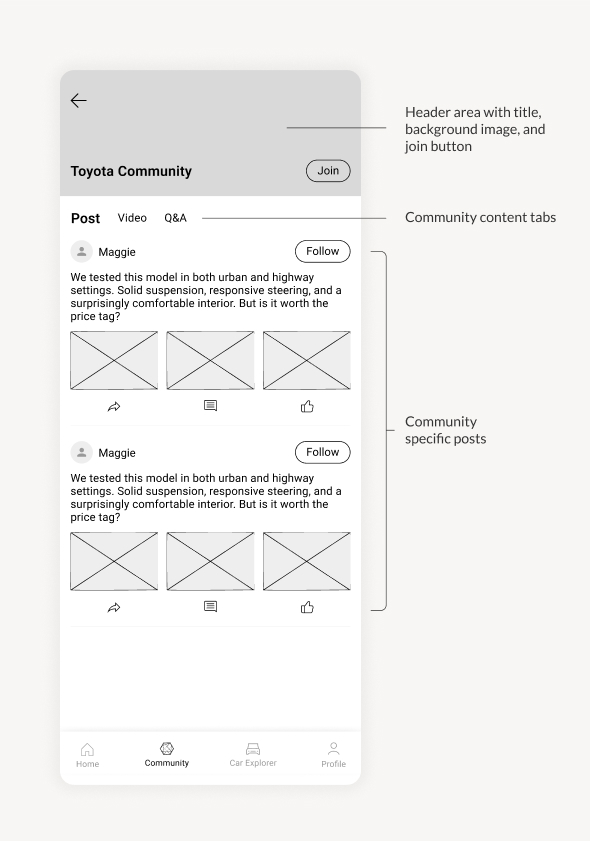
After completing our initial wireframes, we shared early design concepts with stakeholders to gather feedback, identify potential issues, and make sure we were heading in the right direction. Here are a few key takeaways from those conversations.
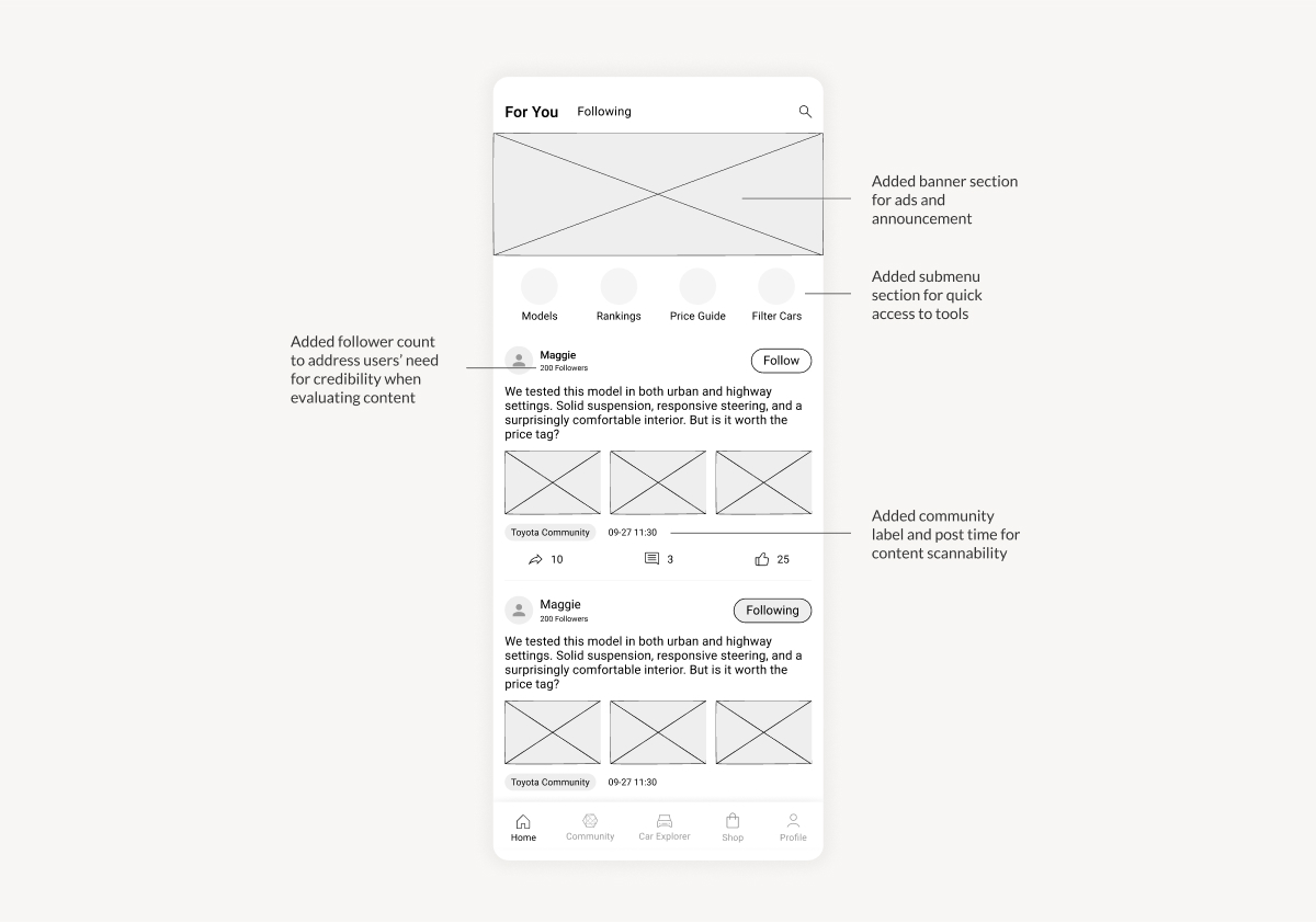
While users generally found the app intuitive, many took extra steps to find tools like filters, compare, and pricing. We believe a quick access menu on the home page could help highlighting these features more effectively.
While we recognized the need for more tailored content, users wanted these content to be organized into a hub to make browsing and discovery easier.
While delivering a strong user experience remains a priority, stakeholders expressed the need to explore revenue opportunities. Our goal is to strike a balance between user value and sustainable business growth.
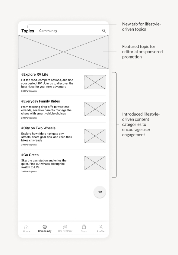
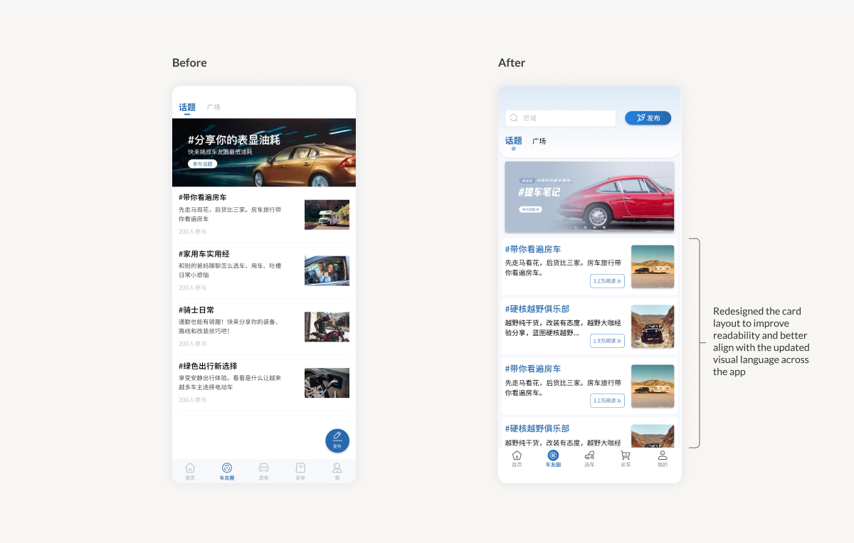
We made several improvements based on the feedback we received. One major highlight was the addition of a new “Topics” page, designed to encourage discussions around lifestyle and hobby-driven content, making it easier for users to explore personal use cases.
We also introduced banner sections across various pages. These not only support monetization opportunities, but also to highlight announcements and promote trending topics to boost user engagement.
Lastly, to help users find what they need faster, we improved information scanability by adding tags and filters across various sections of the app.
With the UX wireframes tested and refined, our next step was visual exploration and continued iterating based on stakeholder feedback. The before-and-after examples below highlight how the product evolved across these iterations.
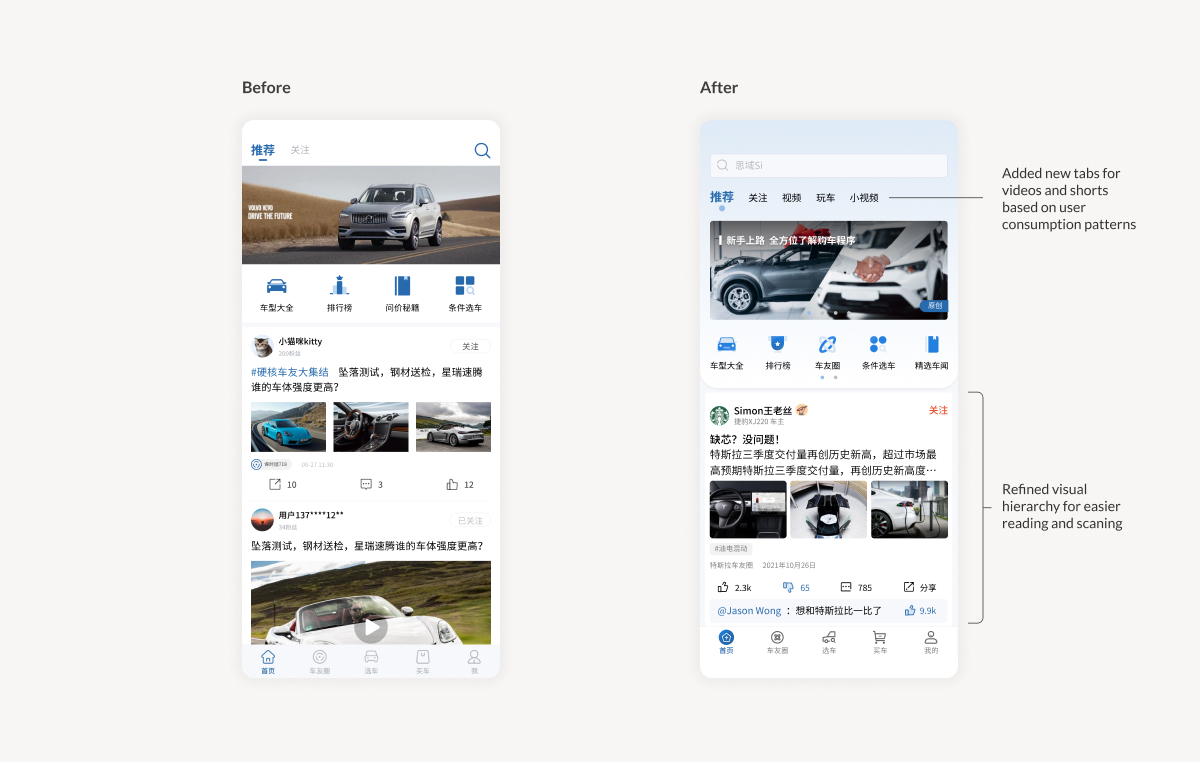

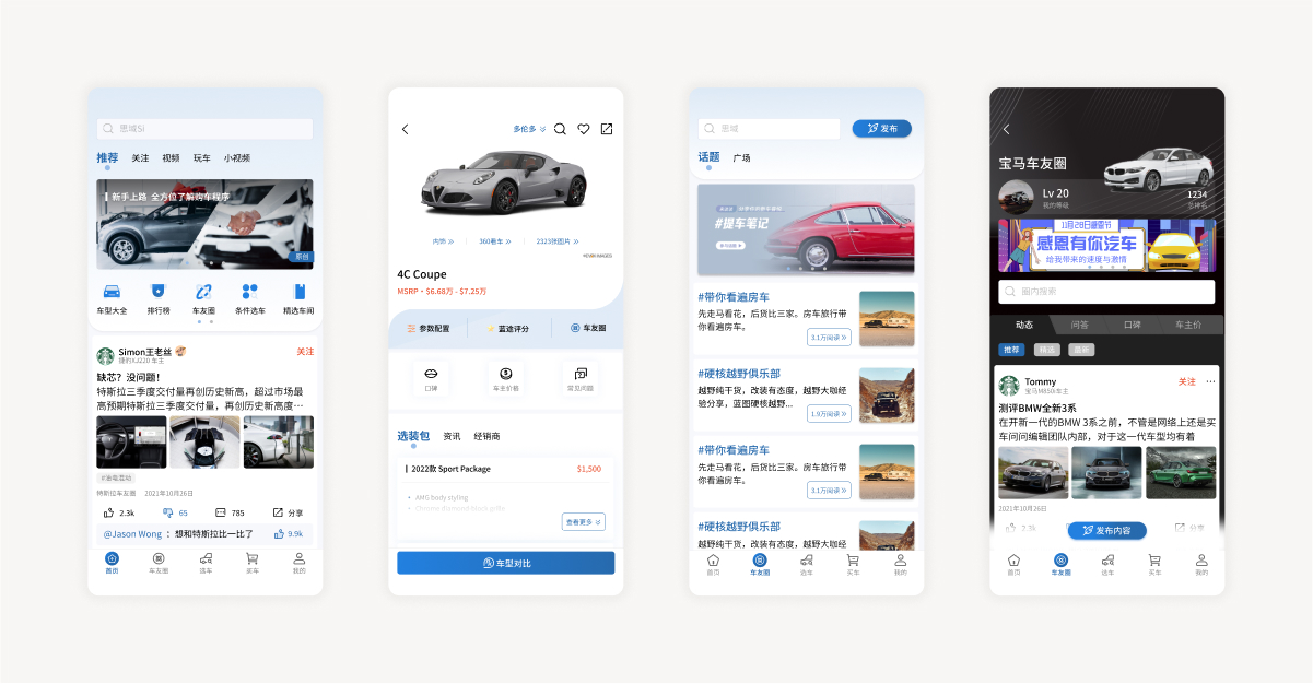
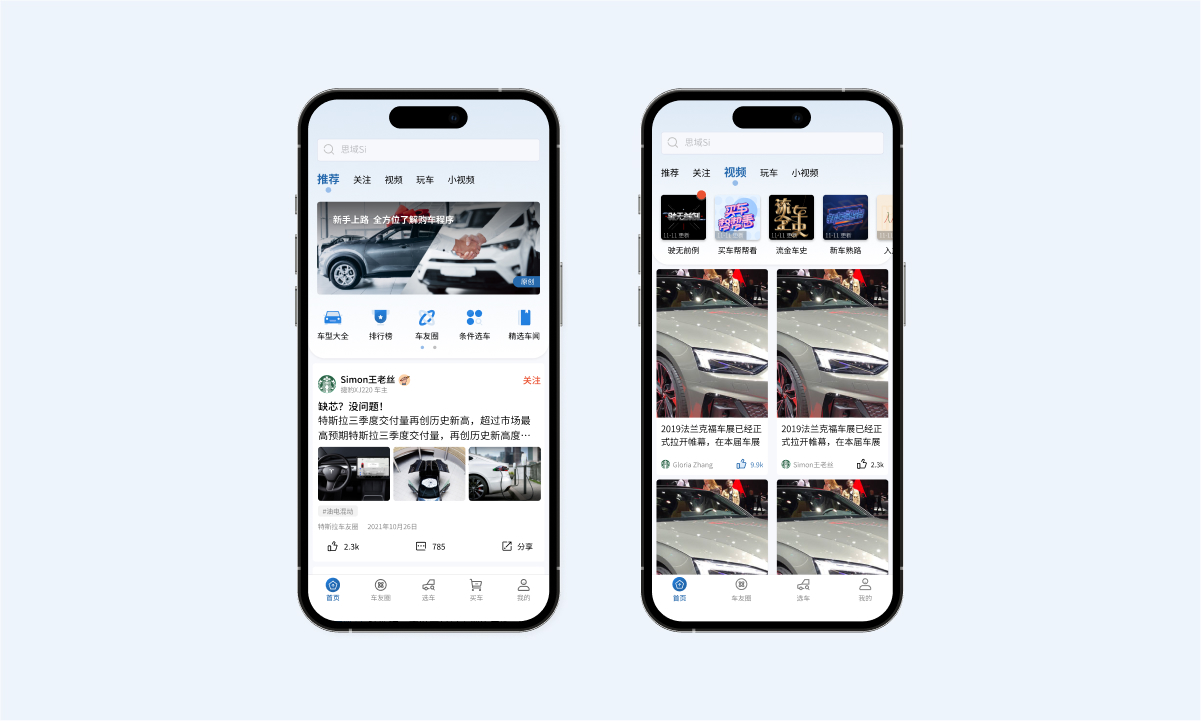
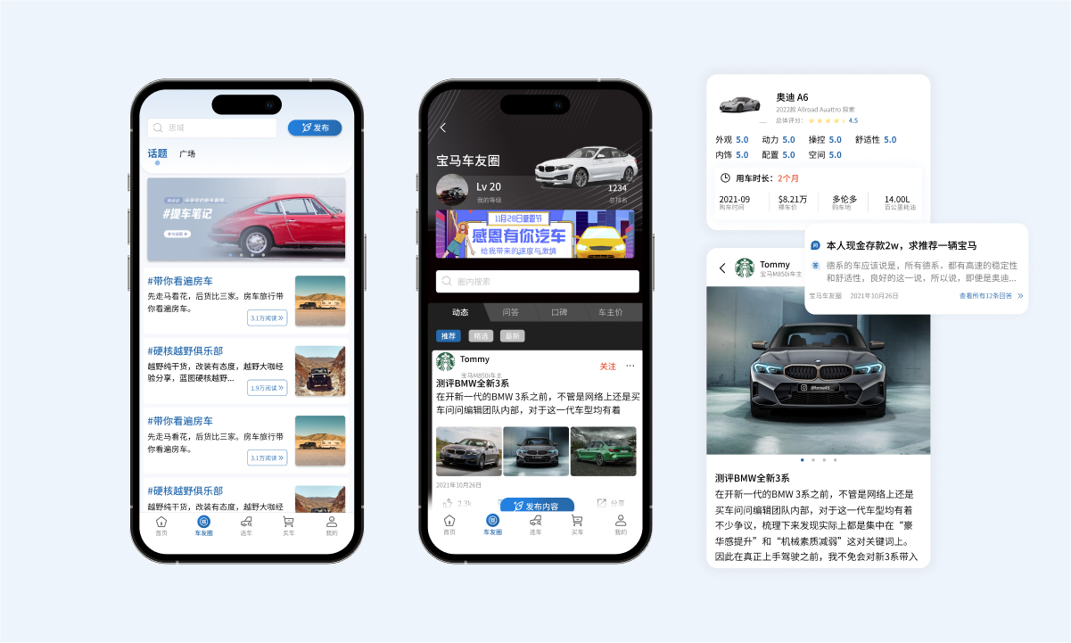
The homepage is designed with a clean layout that supports a variety of content types. The top tab menu organizes content by format to reflect different consumption habits like posts, videos, and short clips. Below the banner, the icon menu offers quick access to tools like rankings, comparisons, and filtered search. The banner section highlights platform-created content such as car buying guides or promotional collaborations, while the post feed shows content the users might be interested in based on their follows or browsing behavior. By combining official resources with user-driven content, we aim to meet the needs of users who value credible information as well as those who prefer real experiences.
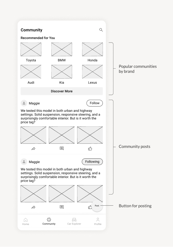
To meet users’ needs for trustworthy information and relevant content, we designed a community space that encourages knowledge sharing and transparency. Verified car owners can leave ratings and reviews, along with how long they’ve owned their vehicle, giving others more insights from real ownership experiences. The Q&A section is designed to ask for advice tailored to personal needs, like “What’s the best car under $20K?” or “Which hybrid works best for city driving?” The Topics hub helps users explore trending conversarions based on their interests, hobbies, or lifestyle. As for the banner section, while it supports our business goals, we also use it as a way for us to stay connected with users by highlighting platform news, announcements, or events.
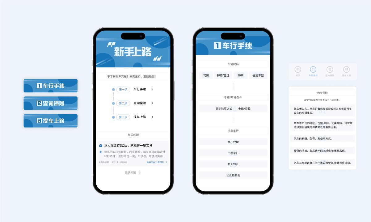
For those feeling overwhelmed by the car-buying process, we created a step-by-step guide tailored to shopping for a vehicle in Canada. It’s broken down into three key stages: what to do at the dealership, how to get insurance, and how to pick up your new car. Each step includes important details users might not know or could easily overlook, such as required documents, different ways to buy a car and what each option involves, and helpful tips to keep in mind.
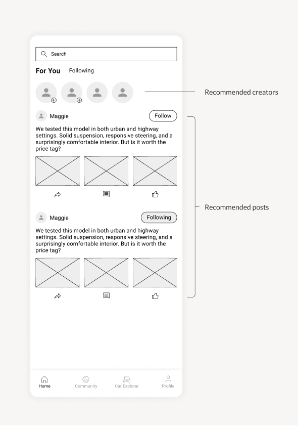
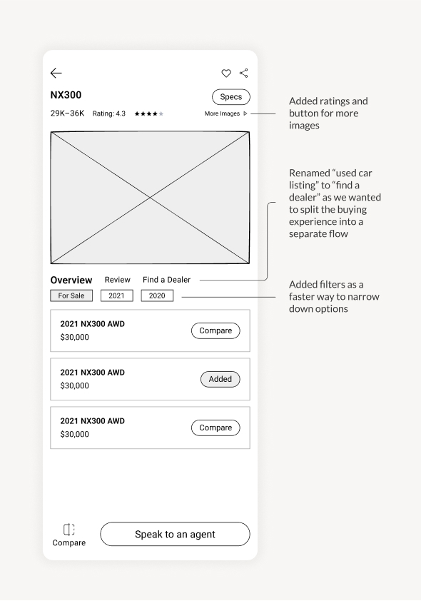
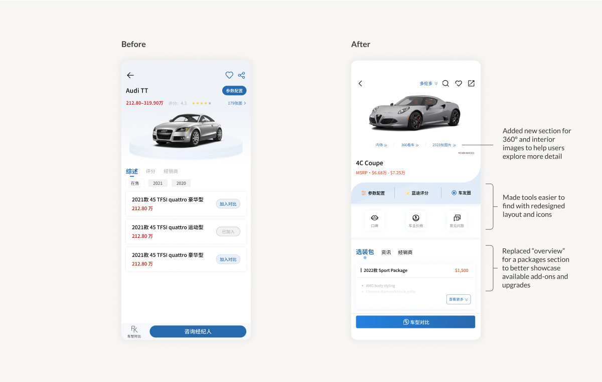
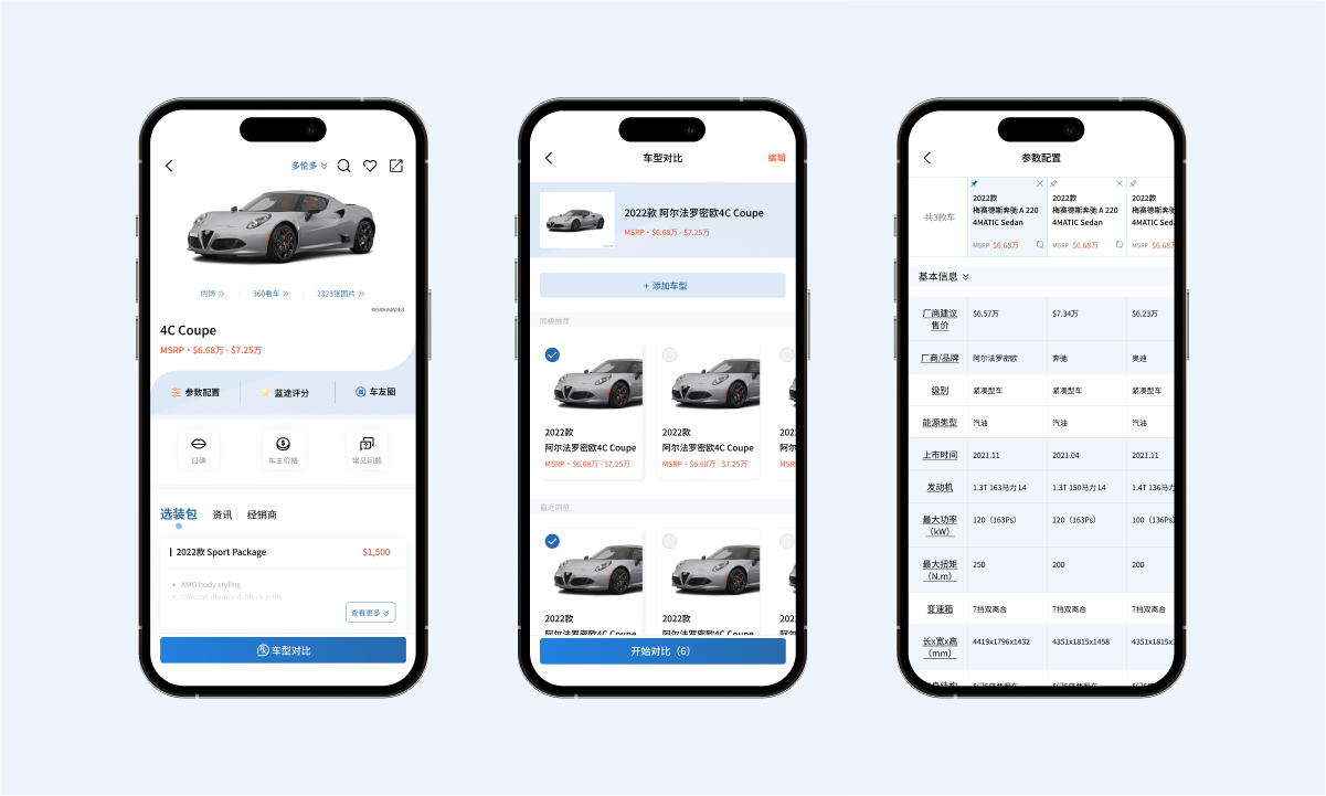
Our car search and comparison tool helps users to explore models across different brands in one place. On the vehicle discovery page, users can browse and add their desired models, then view them side-by-side to compare key details like size, engine type, features, and estimated costs. This gives users a clearer picture of what each car offers without needing to jump between multiple dealership websites.
Looking back, we could’ve benefited from narrowing the scope. There were a lot of features we wanted to offer, but trying to deliver everything at once stretched our resources thin and delayed the timeline for gathering user feedback. Instead, a phased release could have allowed us to deliver sooner and learn more effectively. Even launching partially built experiences would have helped us validate direction and iterate with real user input.
Another thing I would’ve done differently is addressing our lack of backend tracking sooner. It wasn’t until later that I realized our system wasn’t set up to collect some of the crucial data points that could improve the experience. While user privacy is important, basic behavioural data like which posts were trending, which service partners users interacted with most, or how often certain features were used, was never recorded. This made it hard to understand engagement patterns and build user stickiness. If I could do it again, I would raise this sooner as it could’ve made a big difference for both design iterations and business development.