

Edu4All is a project created in partnership with Let’s Get Together, aiming to lower financial barriers to accessing higher education for students across Ontario.
My contribution included research, managing the design process, and team coordination. I also worked closely with the developer to ensure the implementation of important details that mattered to our stakeholders.
To better understand our users, we began by interviewing a small group of Chinese-speaking individuals in Canada who had either purchased a car or were actively looking to buy one. Our goal was to gain more insights into their car-buying habits and pain points.
Traditional student loans often leads to long-term debt. Canada’s fragmented funding system also creates disparities across provinces and performance-based funding can unintentionally disadvantage underrepresented students.
Funding models such as income-share agreements (ISAs), microloans, crowdfunding, and employer-sponsored education are becoming more common globally
There's a growing need for targeted, accessible financial education, especially for youth, Indigenous, and low-income groups. Well-designed programs and digital tools can help them budget, plan, and navigate aid more effectively.
Even with online tools, many students still face tech access issues. It’s important to design inclusive platforms and offline alternatives.
Learning what we found in our secondary research, we want to gain more understanding from the students’ perspective, so we conducted a interview with a small group of university students.
Many students felt the university’s financial aid portal was confusing, disorganized, and hard to navigate. They often weren’t sure what they qualified for, and the overall process felt tedious, overwhelming, and mentally draining.
Many students felt that financial aid was mostly targeted at high achievers with strong extracurriculars or those from marginalized groups. Those who fell just above the eligibility thresholds often felt invisible. Even if they weren’t “in need” on paper, they still experienced real financial stress but didn’t qualify for most funding.
Students often felt pressured to pursue post-secondary education as a necessary step toward better job prospects and a more secure future. However, many questioned whether the high cost of education supports social mobility or fairness, especially when access to resources feels uneven.
While OSAP helps cover the cost in the short term, students were concerned about the burden of repaying loans after graduation. Many pointed out that the real issue lies in the high cost of education itself, which leads to long-term debt and financial strain.
In addition to the interviews, we also gathered quantitative data through a survey to support our insights and validate some of our early assumptions.
While most participants were aware that financial aid exists, over half expressed difficulty qualifying for it or navigating the system. More than 70% still rely on family support, and nearly half juggle part-time jobs to cover their expenses.
Many students expressed concern about job prospects after graduation and whether their degree would be worth the investment. OSAP repayment was also a common source of stress.
Most students rated their financial literacy at 3 out of 5, but many showed strong interest in improving their knowledge, especially if the content is delivered in a simple and convenient format.
After wrapping up our research, our team came together to discuss what accessible education meant to us and brainstormed ideas that could help us move forward. Some of our early concepts were quite ambitious, here are some initial directions we explored:
Tackles the root of the problem
Requires policy-making, which is out of our control
Not feasible within our timeline or available resources
Offers an alternative funding model that reduces upfront costs
Needs institutional support to implement
Research revealed ongoing controversy around existing ISA programs
Easy to test, build, and deliver within our resources
Many students lacked financial knowledge and wanted to learn more
Doesn’t fully address the root issue
Improves the access problem and aligns with user needs
Could be monetized in the future to support operations for the nonprofit partner
May still overlook students who don’t meet traditional criteria
Through group discussions, we started to form a clearer picture of the kind of experience we wanted to create for both students and institutions across Canada. One of the biggest pain points that came up in our early research was how fragmented and overwhelming the current financial aid process is. Students often have to jump between different portals, each with its own system and criteria. In response, we envisioned a centralized and smart platform designed to eliminate these barriers. Here’s what that vision includes:
Students would create a single, comprehensive profile, entering their personal, academic, and extracurricular information. This would allow our AI-powered system to automatically match students with eligible scholarships and bursaries. They would receive direct notifications for new opportunities and could apply on our platform with just a few clicks.
Institutions would have a dedicated portal to post opportunities and define eligibility criteria. They would receive standardized application packages, which reduces their administrative overhead and allows them to focus on the selection process.
This platform would eliminate the need for students to navigate dozens of websites and for institutions to build and maintain their own application systems. By pooling resources and standardizing the process, we could create an experience that saves time and reduces stress for everyone involved in financing higher education in Ontario.
While our vision was ambitious, we recognized that building trust and getting institutions and students on board would take time. Given the limited timeframe of our partnership with Let’s Get Together, this vision serves more as a long-term roadmap our partner can continue to build on. In the meantime, our team aligned on a direction that balances user needs, feasibility, and available resources to define a clear MVP and lay a foundation for future growth.
We wanted to design an experience that’s easy to navigate and helps students quickly find scholarships, grants, and other funding opportunities they actually qualify for.
We wanted to provide financial literacy content that is relevant to students, including topics like budgeting, student loans, and repayment. It would be delivered in a flexible and convenient format.
Key features we wanted to offer:
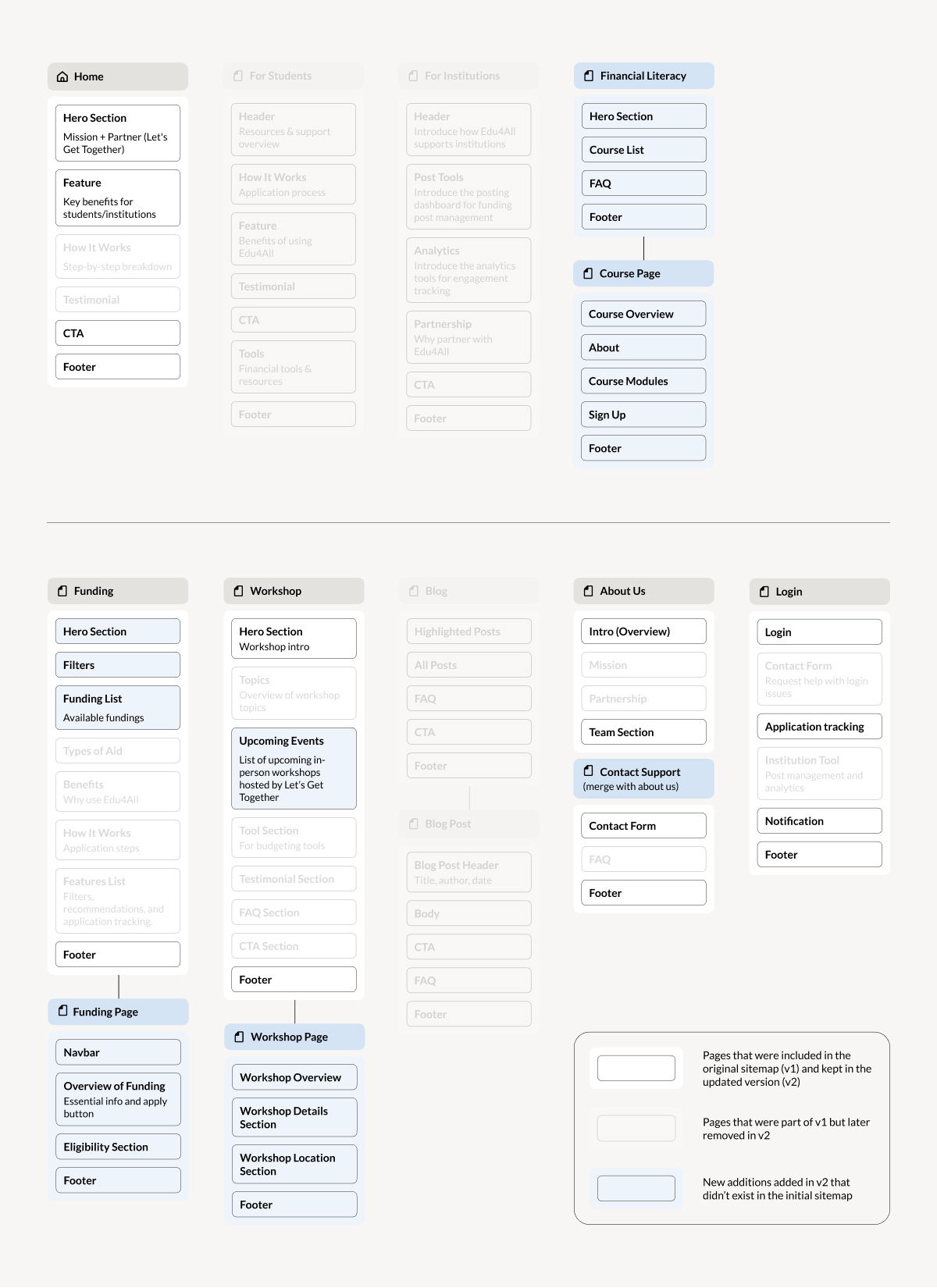
Since we have defined a clear direction for our product, our team split into two groups to better allocate tasks. The developer and I focused on platform design and product execution, while the rest of the team worked on outreach and content development for the financial literacy courses. As part of the platform group, the first thing we worked on was mapping out the information architecture.
Initially, we planned to deliver the financial literacy courses in person, since many students expressed that they learn better that way. However, after meeting with our partner and discussing their available resources and personnel, we decided to include online delivery as well to offer more flexibility for students.
This diagram shows a merged view of our initial and updated sitemaps.

Pages that were included in the original sitemap (v1) and kept in the updated version (v2)

New additions added in v2 that didn’t exist in the initial sitemap

Pages that were part of v1 but later removed in v2
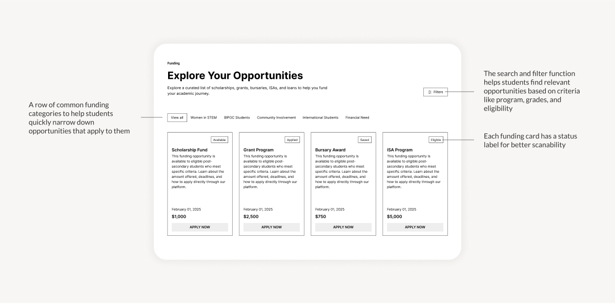
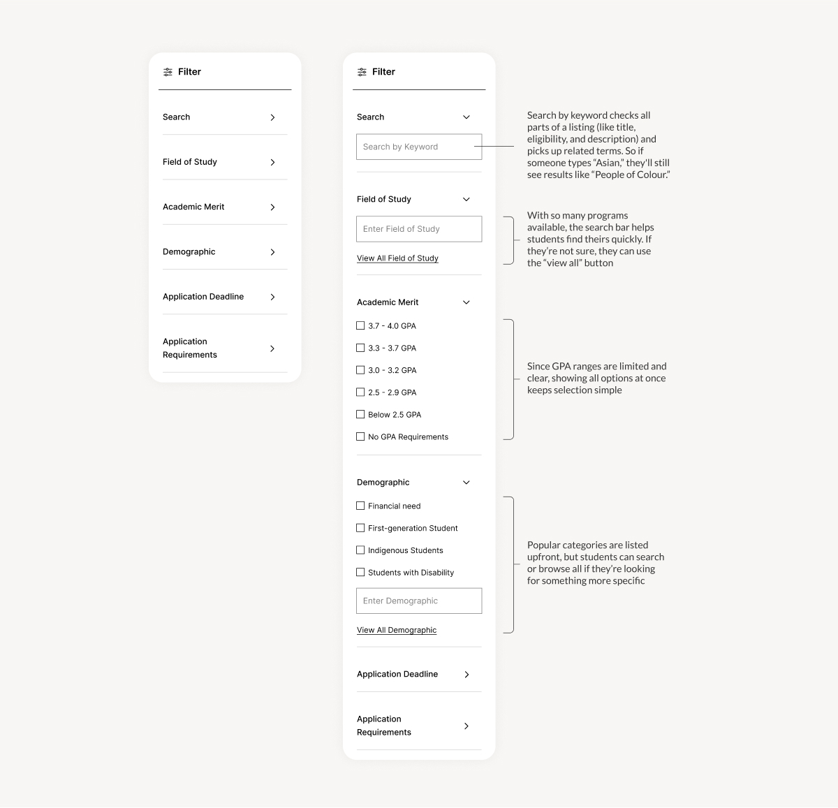
Using the sitemap as our guide, I began to transform the platform's structure into screen layouts. The wireframes map out the essential elements for the core product experiences.
After completing our wireframes, we conducted a usability test and checked in with our partner to share progress. The response was generally positive, but we ran into one major constraint. Our partner didn’t have the technical staff to maintain the product after handoff, which meant we had to pivot our approach halfway through the project.
The funding cards were much more readable compared to the university’s existing financial aid portal. Participants found the status labels helpful in quickly identifying which opportunities they were eligible for.
Users found the filter design intuitive and appreciated the push notifications that helped them stay up to date with new opportunities.
Our partner shared concerns about their ability to manage the platform post handoff. As a small nonprofit without in-house developers, maintaining a platform would be challenging. This raised the need for a more sustainable, low-maintenance solution.
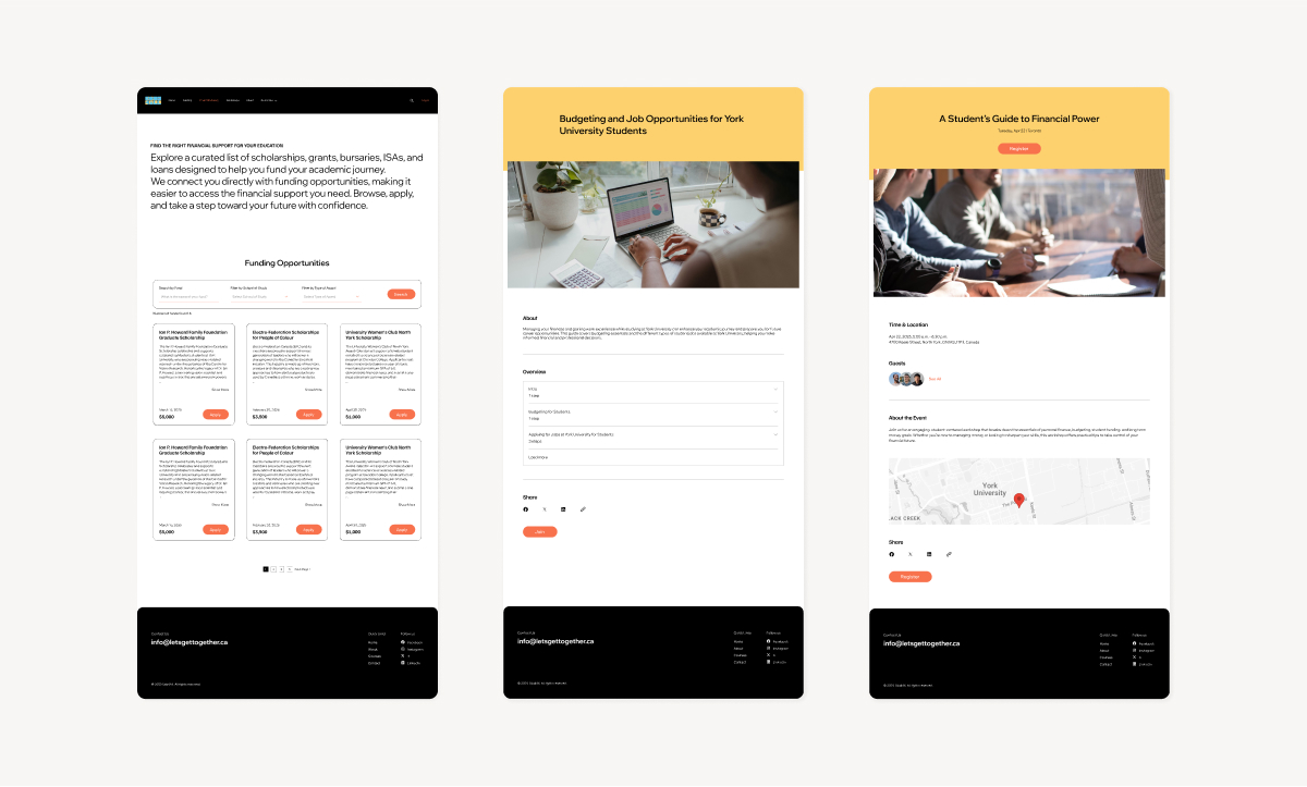
To address this newly arisen concern, we proposed using Wix as a short-term solution. Its built-in CMS, course module plug-ins, and event tools allowed our partner to manage the platform without any coding. While Wix didn’t give us full freedom to customize features or UI, it provided enough functionality to support the initial launch and helped our partner engage users while working toward securing future resources.
The project has now been handed over to our partner organization, Let’s Get Together (LGT), who will manage its future development. Future partnerships formed by LGT can build on the foundation we’ve created to further grow the initiative. Potential next steps include:
Using AI for funding recommendations or chatbot assistance would make it easier for students to get personalized guidance quickly, without having to dig through all the resources themselves.
Partnering with finance professionals to improve the credibility and accuracy of our course content while also allowing us to expand into new topics that students want to learn about.
Hosting in-person workshops gives students the chance to learn financial literacy in an interactive setting, especially for those who prefer face-to-face learning and want to connect with peers.
Transitioning off Wix to a fully custom platform for more flexibility, scalability, and long-term stability. It could also open up new opportunities for revenue generation for our partner.
Each one of the challenges we faced in this project pushed us to think more critically and adapt to real world constraints. Since our partner is a nonprofit organization with limited staff, technical expertise, and resources, we had to tailor our approach to ensure the final outcome would be feasible for them to manage after handoff.
Time was also a major constraint. With only a few months to work on the project, we broke down our vision into smaller phases and focused on delivering a functional MVP. We hope that future teams will carry on to build upon this foundation we’ve laid.
This project taught me a valuable lesson in balancing goals with reality, and knowing when to push forward and when to adapt to the hand we’ve been dealt.